Guide to Choosing the Perfect Interior Color Palette
Choosing the right color palette is one of the most essential steps in interior design. Colors influence mood, space perception, and the overall aesthetic of a room. Whether you’re designing from scratch or refreshing a space, the right palette will help you create harmony and personal expression.
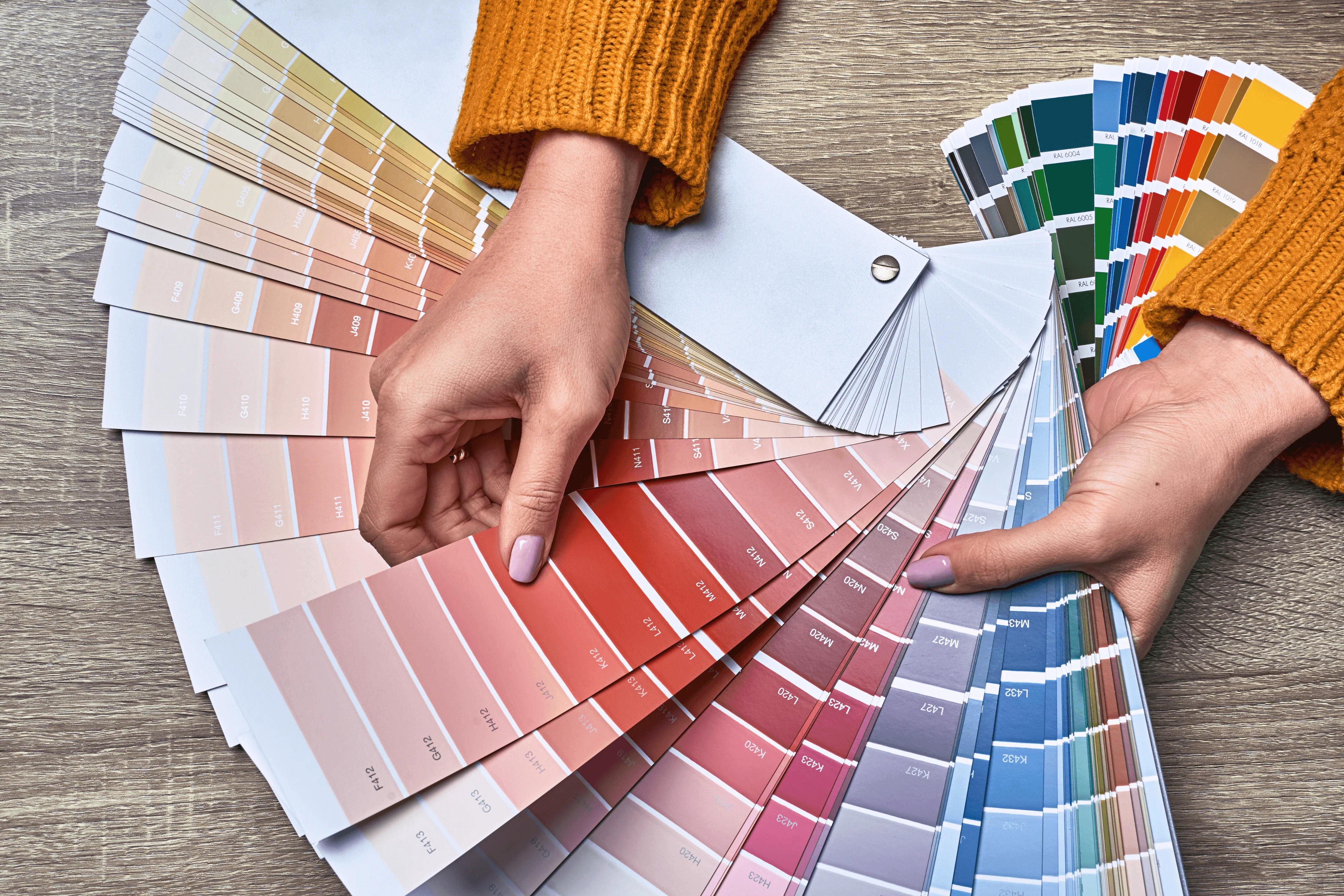
Start by identifying the mood you want to evoke. Soft neutrals like beige, taupe, and warm greys create a calm, inviting atmosphere. For a bold, energetic feel, explore jewel tones like emerald green, royal blue, or burnt orange. Consider how each room functions and tailor the palette accordingly.
Use the 60-30-10 rule to balance colors: 60% dominant (walls), 30% secondary (furniture/upholstery), and 10% accent (decor, cushions). This ratio helps maintain visual balance without overwhelming the space.
Always test paint samples in natural and artificial light. A color that looks cool and muted in daylight can appear warmer at night. Create a small swatch wall to compare tones over several days before finalizing.
Think about color flow between rooms. Open concept spaces benefit from palettes that share common tones, while enclosed rooms allow for more contrast and variation. Use transition colors in hallways or rugs to tie rooms together.
Don’t forget undertones! A grey with a blue undertone can clash with a beige that leans pink. Match undertones in your paints, fabrics, and finishes to keep everything cohesive.
Nature is a great inspiration—earthy tones, ocean hues, forest greens, or desert sands all bring balance and serenity. And remember, trends come and go, but a well-chosen palette will keep your space timeless and livable.
Understand Color Psychology
Colors affect mood. Blues and greens are calming, making them ideal for bedrooms. Yellows bring warmth and optimism, perfect for kitchens. Red energizes, great for dining rooms in moderation. Use psychology to align colors with each room's purpose.
Build a Cohesive Scheme
Decide whether you want a monochromatic, analogous, or complementary scheme. Stick to 2–3 main colors and add depth with textures, patterns, and layering. This creates visual interest without chaos.
Test Before You Commit
Use sample pots or peel-and-stick swatches to observe color in different lights. Spend a few days living with it before deciding. Lighting, shadows, and room orientation can drastically affect how a color looks. A shade that feels cozy and soft in morning light might appear dull or harsh under evening bulbs. Always apply samples to multiple walls—especially those facing different directions—to see how natural and artificial light interact with the color throughout the day. It's also helpful to test the paint against your furniture, curtains, and flooring to ensure harmony. Hold fabric swatches or place décor items near the samples to visualize the final look. Observe how the color complements other design elements like cabinetry, tiles, or metallic finishes. Consider how seasonal changes in lighting might impact the shade’s appearance. Also, take into account the room’s use and how frequently it’s occupied—more vibrant colors may suit lively spaces, while subtle tones are ideal for relaxing zones. Keep in mind that wall textures and finishes—like matte, eggshell, or satin—can also alter how the color appears once dried. Additionally, try viewing your test areas at different times of the day, from sunrise to sunset, to ensure consistency. Avoid rushing the process—what looks perfect on a color card or digital screen might feel completely different once applied to a larger surface. Taking time to observe, reflect, and compare helps avoid costly repainting and ensures you're confident in your final choice.